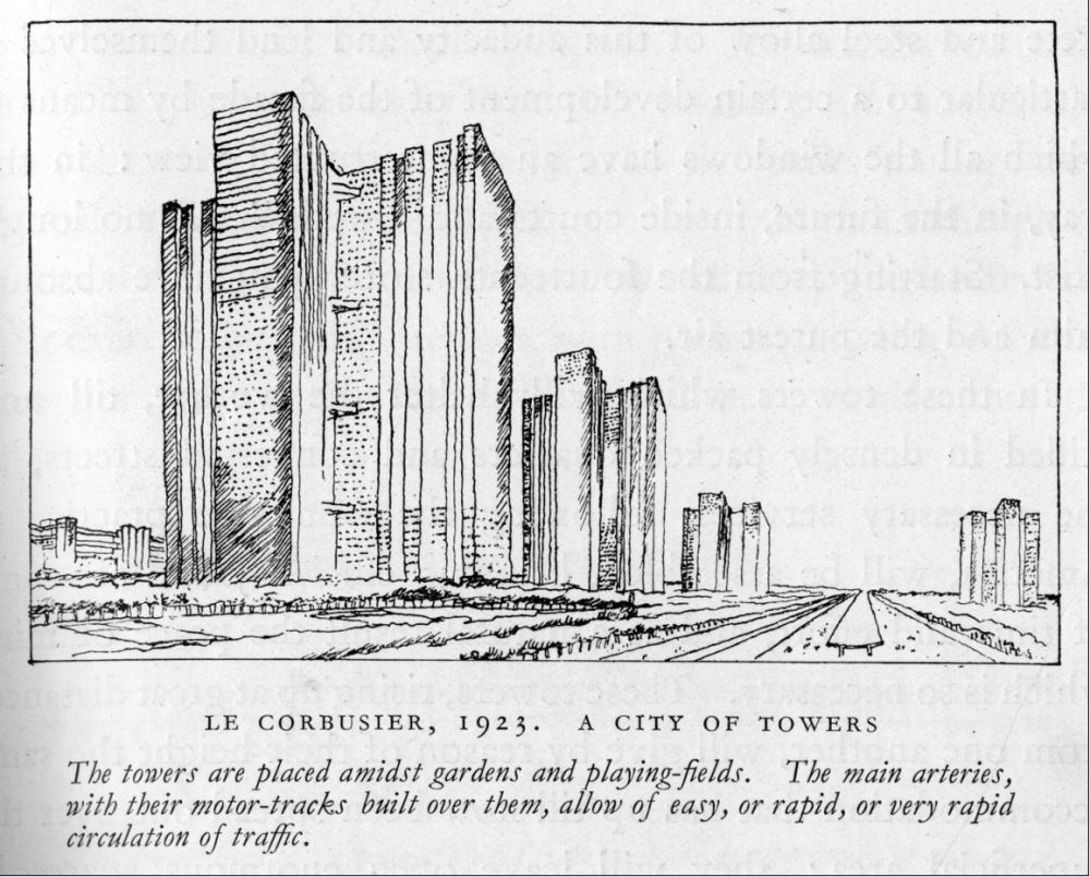
The “Ultra Compact City Concept” has a lot to do with Le Corbusier, I must admit. It is equally radical, and it’s heavily inspired by annoyance at how unsuitable his city designs are for people to live in.
The most damaging architect of all time?
Cities should be everything Le Corbusier’s cities are not. Cities should be compact and easy to get around, reducing car usage to a minimum. Cities should have mixed use zoning to make life practical. Cities should be built to a human scale with organic shapes and not with megalarge geometric straight lines – my favourite architects are Friedensreich Regentag Dunkelbunt Hundertwasser and Antoni Gaudí i Cornet, while Art Nouveau is definitely the architectural direction I like most.
The primary goal of the design should be to make the city pleasant and interesting to live in – not to fill it with big monumental buildings with large spaces around so the architects’ masterpiece can be visible from afar. Cities should be walkable so that it encourages you to get out of your flat and go do something! Tall buildings should be put closely together and the big parks be put outside of the city – even if this means everyone won’t have direct sunlight shining on their windows the whole day. And finally – it should be made so pleasant to live in tall buildings downtown that this would be the preferred option.
However, what I dislike most about Le Corbusier is that he’s discredited both the idea of radical new city designs as well as really compact cities. People often laugh at the idea of living in flats as opposed to standalone houses – flats are for the poor, who’d want to live there if you can afford a house with a (tiny) garden?
Cities should be designed for people and not cars
The primary ideal with the Ultra Compact City Concept with an underground road system is to create a vibrant and compact city with pedestrian-friendly streets which you would prefer to navigate primarily on foot, with the aid of public transportation. The high density means cars won’t be necessary to get most day to day activities done. Instead, your day’s activities should be located reasonably near your home, something that can be achieved by having housing, offices, factories, shops and entertainment mixed together.
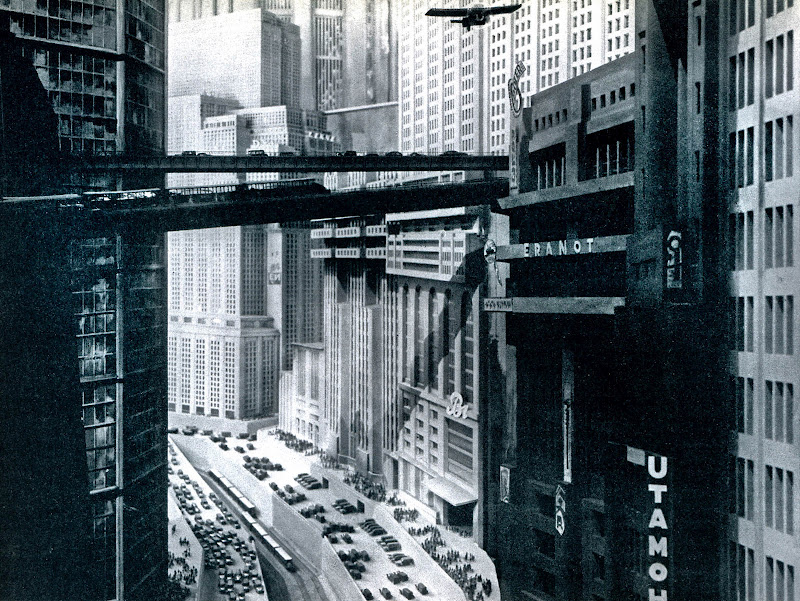
Another future that has (almost) become a not-very-successful reality is Fritz Lang’s Metropolis from 1926. Again, this is a very hard city environment that you might be willing to work in but probably not raise a family in.
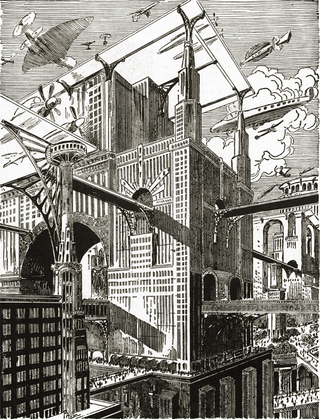
This image on the right looks a bit more friendly though? It is primarily a walking city, with some transport links as well. Why not try to make this our future?
Articles on Le Corbusier:
- The problem with Le Corbusier
- Inhumane Le Corbusier
- The Pol Pot of architecture
- What were they thinking?
- His most successful work?
- It wasn’t his fault


